Learn to design with Figma - Free Figma tutorials

Learn Design Pilot
Want to get started in design, but don’t know where to begin? These lessons and exercises will help you start designing immediately.
1. Getting Started
Hello and Welcome!
If you’ve ever wanted to pursue a career in design, learn the ins-and-outs of the design process, or just want to improve your relationships with the designers in your life, you’ve come to the right place.
Regardless of why you want to learn about design, here at Figma, we want to make it as easy as possible for you, so we built this Learn Design program. This doesn’t exist just to help you learn to use the tools that we’ve created but to learn the fundamentals of design and the concepts behind the largest digital products that exist today.
You may want to use design to explain, to tell a story, to plan, to problem-solve, or to make something look nice. These are all goals you can achieve through designing. Often, people think design is about the way things look. That’s just one element of design, but we’ll jump into what design is in the next section. For now, let’s look at some of those visual parts of designing.
A visual design, like a billboard, app screen, Facebook ad, or icon are compositions of basic shapes to make something greater. Lines, rectangles, circles, and triangles make up the majority of design. There are also images and text, which we’ll look soon, but let’s start with the basics.
Here is a screen from the Apple Music app:
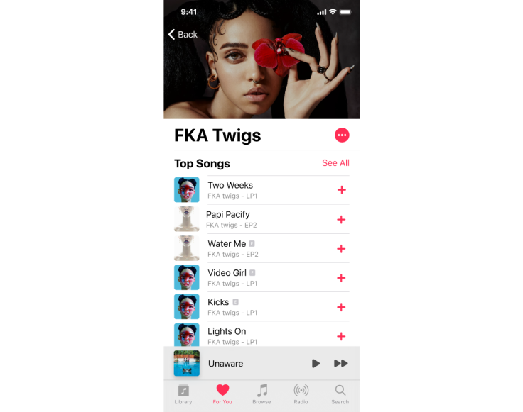
It’s a series of shapes, images, and text organized in a composition. The designers that created it arranged these items with a few goals in mind. There are always the business goals of a product, such as “get customers to add more music to their playlists.” The designers also focus on goals like readability — how easy it is for the most people to read the information of the screen — and usability — how easy it is for the most people to conduct the intended action(s), such as discovering new albums. We’ll look at a lot more goals during the rest of the lessons in this course.
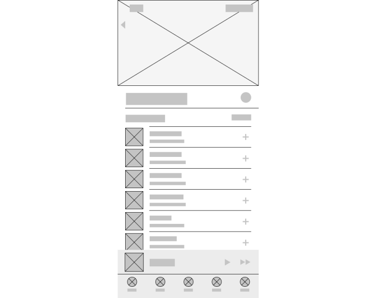
Below is a file of the Apple Music screen from above with a collection of its objects and a wireframe. Click the "Open Activity in Figma" link to get a copy of the file. If this is your first time using Figma, you can create an account in minutes — for free. Click the "Sign up" button at the top of this page to get started.
Once you have opened the activity, drag the interface elements to be on top of the shapes in the Frame to the right.
At this point, hopefully, you have a better sense of how apps on phones can be constructed with the basic building blocks of lines, rectangles, circles, and triangles. Look at your favorite apps on your phone and consider the pieces that they are made up of.
The same is true for the web, or even billboards, magazines, books. They are mostly made up of these basic shapes arranged together to achieve goals and to look visually pleasing.
As you learn to design, you will learn how to arrange different objects in layouts and interfaces to achieve your goals, as well as understand why and how to achieve the goals of your company or client.
Why learn how to design?
Design is important. Companies that succeed at disrupting age-old industries offer a better experience, often while solving the same problems. A simple example: Uber and Lyft versus taxi cabs. Both of these services provide an app to request a ride to a specific location on a map, whereas taxis need to be flagged down or called through a dispatch service.
As the physical world goes digital at a frenzied pace, and smartphones are putting technology in the hands of billions, companies have an imperative to innovate and are now competing on the power of their customer experience. Design’s role has moved from a nice to have to a must have to a differentiator. As a result, designers have more influence — but there are not enough designers to meet demand.
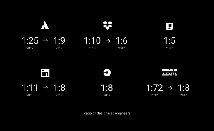
This is especially true in product design at companies building digital products. Over the past few years, companies have grown their design organizations because they understand that user experience is becoming the key differentiator. As a result, there has been a shift in the designer-to-engineer ratio at many companies, here are just a few examples:
What is this design course?
This course is an entry into digital design, both in concept and in practice. We believe everyone can learn how to design, and access to design education should be free and readily available. The more people who can design and build the things they imagine, the better the world will be.
There are many existing barriers to becoming a designer: from cost — it can be expensive to buy design software and computers capable enough to run them — to knowledge, because digital design is a new field, and many universities don’t yet offer specific classes and courses in designing digital products.
So we're building a free course and community for learning design fundamentals to prepare you for entry into—or growth within—a digital design career.
This course is focused on Digital Design: the creation of apps, websites, and digital images—we’ll specifically focus on the first two. That means we’re not focusing on print design or industrial design either. Regardless, the same fundamentals—the concepts and technical skills—that you will learn to apply to many forms of design. A robust grid system, built for the web, for example, can easily be translated to print design, and vice-versa. Frequently the fundamental differences between disciplines of design are a few key terms and the software applications used in that industry.
In this course, you’ll go through each step in designing and creating a digital product. From identifying an audience for your product, doing research, considering ethics and accessibility to designing icons, grid systems, color palettes, compositions, and more. There are Lessons to learn about core concepts and Design Exercises for you to practice the skills you learn.
This course is self-paced; however, we recommend you don’t try to fit it into one weekend. You can consider the design exercises throughout as milestones. Give yourself enough time to understand each concept.
What you’ll need for this course:
You’ve already got everything you need! If you’re reading this, you have a modern web browser and an internet connection. Some videos may use a significant amount of data, approximate video file size will be included in each video description.
To follow along with the design exercises, and design in Figma, you’ll need access to a laptop or desktop computer as well. Figma works on Chrome OS, Linux, macOS, and Windows; no installation required.
What this course looks like:
- Lessons. These are each based on core concepts in design. They can be consumed together, or independently.
- Design Exercises. This is your chance to open up a Figma file and put a lesson into practice.
- Further reading. These are resources that we like but are not made by Figma. They may be free articles and videos, but some may be books. Please don’t feel that you have to purchase anything that you do not feel comfortable buying.
- Figma Community. Available at spectrum.chat, this global community of designers and Figma customers is another resource for you. Head over to the Critique channel for feedback on your design exercises.
- Playbook. Our friends at Playbook are here if you have questions about growing as a designer, your career path, working in the industry, and more. They bring designers together in one place to share actionable career advice with each other.
And that’s it. We have three key principles at Figma: Foster Inclusivity, Be Bold, and Have Fun! My personal favorite is Have Fun! It’s core to Figma’s philosophy, and we believe it is fundamental to design itself.
Like many great designs, they get better with time through iteration. This education center is no different. Don't worry, you won't have to come back and re-read all of this content frequently. We aspire to improve this content as we find typos, grammar mistakes, or even incorrect information but the industry is fast moving and ever-changing, so we'll do our best to stay on top of it with relevant concepts and examples regularly.
So with that, let’s dive into what design is.
2. What is Graphic Design?
A common misconception is that design is merely making things pretty. It’s true, there is an element of design that is purely aesthetics, but it’s not inclusive of everything that design is. Here is a non-exhaustive list of some of the things that design is:
Design is all around us.
It impacts the way objects and environments function. It is something that is executed by everyone, including you, even if you've never considered yourself a designer. You make design decisions all the time, at school or work and in your personal life.
Every choice you make to solve problems is a design decision. The way you get ready, by brushing your hair, then having a coffee, and finally brushing your teeth, is a design decision—an intentional choice to design your morning in a particular way.
This might have developed out of the way toothpaste was making your coffee taste and the coffee staining your teeth. You solved these problems at some point by ordering your routine so that coffee came before teeth brushing.
Design is problem-solving.
Signage added to a door to indicate if it’s opened via push or pull is fundamentally helpful, right? A better design would be to make the door's direction intuitive; having a handle on the pull side and a flat area to push against on the other, with or without labels. But design isn't just the visual indication of which way the door swings.
Deciding that the door opens when pushed from the inside, in case of an emergency, is a design decision and is probably the most critical consideration. It’s not just the obviousness of which way the door swings, but the consideration as to the best direction for the door to open.
If you're a door designer, for example, the problem you are solving for would be: we need to make doors safer. The solution of allowing a door to be pushed open from the inside, especially during an emergency, does solve that problem; and doing it with an intuitive, beautiful push plate on the inside of the door makes it an elegant solution to the problem.
Design is an act of listening, empathizing, and acting on that information.
Hearing our customers and their needs is a way that we can best ensure that our designs are solving the right problems. The solutions we're creating are addressing the needs of real people—solving problems that they might otherwise be frustrated by.
The best way for anyone in the design discipline to create a product or service that actually addresses a person’s needs is by listening and understanding their problems in the first place.
Many products are built without listening to or consulting consumers, which usually ends badly. Intercom, a company that offers customer support tools, said this best:
If you were a chef wondering if customers are enjoying your new soup recipe, how would you find out? It’s not rocket science.
In an ideal world, it’s best to ask people who either use your solution or would consider using it what they think both before and after presenting them with your idea. This way, you can get feedback for consideration while you’re still working on it—before it’s too late to implement.
Design is storytelling
A good story has a distinct beginning, middle, and end; a mapped out journey for a viewer to explore and spend time encountering on their own. When reading a book or watching a movie you progress through the story in an order that hopefully makes sense, and experience it as it unfolds.
As your customer progresses through your app, website, infographic, three-dimensional world, etc. they are experiencing your story. This is what User Experience, or UX, design is; and is a part of the tools you have available to help people understand what problem you’re solving, as well as how to interact with your creation.
How someone moves through a physical space is similar to this: they are presented with visual information, and from that, they are choosing how to proceed next. You could encourage someone to move through a building with navigational signs, or more subtle elements, like architecture that draws them in on their own.
Your customer may have an adverse experience and leave if they get confused (closing your app) or a negative experience that has them running out the door if something scares them (deleting your app from their device).
People use digital products in unexpected ways, so it’s important to best guide them in the ways that we’ve built them to be used. By actively guiding our customers, we’re able to help them have a great experience and ultimately get the most out of our products.
Writing is core part of the design process that should be taken into consideration. Spelling mistakes are as much an error of the designer as they could be for a copywriter or other content creator. Since design is not just how your creation looks, but how accessible it is to your audience, the clearness of the words on the page matter as much as your font choices. More on creating access and being inclusive in the Inclusion lesson.
You may be asking: why am I being told that design is about writing and storytelling? Consider the impact of a sentence with spelling mistakes in an app about healthcare offerings or on your bank’s website. It’s vital that people trust both of those services and a poorly written sentence, or worse, a poor experience using the product has real-world, adverse effects on how you feel about both the brand and its products.
Another consideration to keep in mind is that new design technologies and trends are always appearing. Understanding and leveraging a fundamental like storytelling will better prepare you for new types of designing, such as the latest trends in chatbots and augmented reality.
Design is function, then form
It’s not just making stuff pretty—that is often a consequence of functioning well and offering a great experience for your customers/audience.
Most people make the mistake of thinking design is what it looks like, people think it's this veneer—that the designers are handed this box and told, 'Make it look good!' That's not what we think design is. It's not just what it looks like and feels like. Design is how it works.
To go back to our push/pull door example, a clear indicator of how to use a door can be beautiful while being functional, be it an ornate handle or art deco typography.
The use of well-crafted beauty can help accomplish your goals of indicating the direction a door opens, and also becomes aesthetically pleasing, adding to the overall interior design or architectural narrative of a space.
Creating the best solution for your customers’ problems often results in a product that is pleasant and enjoyable to use.
Design is aesthetics
I know, I just said it’s all about function.
But, there are lots of positive consequences of solving a problem, telling a story, and making something that functions well: it often turns out being simple and easy to use. There is always still an opportunity here to visually polish it further. These are the extra steps it takes to win over your competition and to grow your product in the long run sustainably. If all bank accounts theoretically hold your money, then how are they different? Easier to use, and dare I say fun?
There is also a phenomenon known as the Aesthetic-Usability Effect, which is a perception that people believe a more aesthetically pleasing product is easier to use than a less-aesthetic design—even if it’s not easier to use. This is similar to attractiveness bias, which is often referenced when discussing the United States presidential election of John F. Kennedy v. Richard Nixon.
Every design begins with the same essential elements—points, lines, and shapes. Similarly, even the most complex designs can be reduced to these vital pieces. We believe that great design is one where these pieces are used efficiently together.
For instance, in the early days of designing Figma, we often talked about what tools you need to create modern designs for screens. We realized that the toolset does not have to be large if the tools are carefully selected and work together well. With a small set of functions (like the Vector Network tool or a Frame), designers can create a lot of different things to form sophisticated means of expression.
The same is true for communications design. You can create much of our designed world by using a small set of elemental shapes to build things of high complexity. Although the use of primary shapes and colors was famously promoted at the Bauhaus school as fundamental to design, these forms have been part of the language of design for hundreds of years.
The famous New York Subway Map and signage is an excellent example of this in action. Before its total design overhaul in the 1960s, the New York Subway system was an exercise in confusion with hundreds of signs inconsistently designed even within a single station.
It wasn’t until 1965 when graphic designers Massimo Vignelli and Bob Noorda took on the job of building the subway a visual identity with usability at its core, that it became much easier to navigate the system—thanks to well-considered signage and iconography. The pair focused on building a system that solved a problem, consistently, and was aesthetically pleasing at the same time.
The result is the same design system you may know today. The designers created a 182-page manual for the New York City Transit Authority that outlines all the ways the design should and should not be used—and it remains one of the most iconic bodies of work in the world.
Designs often have a visual element or existence, and the visual embodiment of a design is, ideally, pleasant to look at and experience. Often, if you set out to design your product in a way that is holistically focused on ease of use, aesthetics will follow.
Design is asking questions
As a designer, you must ask “Why?” Maybe not as much as an inquisitive four-year-old, but close.
Who are we designing for? What are the problems that they face? How can we go about solving those problems? Why might our solution not work? What can we do about that? Why was a decision made by our team or company?
There are lots of questions to be asked before, during, and after a product is created or redesigned. Question your coworkers and your customers.
Stay curious.
Design is practicing
Being a designer entails spending time building your experience level. You are not going to be great on day one. That's okay! It's important to keep doing it, you will get better. Ira Glass, talks about the creative gap between knowing something looks good, but not being able to create it. This is a valuable step in your journey to become a great designer. Understanding what works, what looks good to you, and building toward it. Ira Glass's advice for beginner creatives:
...we get into it because we have good taste. But it's like there is a gap. That for the first couple years that you're making stuff, what you're making isn't so good. Okay? It's not that great. It's trying to be good, it has potential, but it's not quite that good. But your taste, the thing that got you into the game, your taste is still killer. And your taste is good enough that you can tell that what you're making is kind of a disappoint to you. You know what I mean?
A lot of people never get past that phase, a lot of people at that point, they quit. And the thing I would just like say to you with all my heart is that most everybody I know who does interesting creative work, they went through a phase of years where they had really good taste, they could tell what they were making wasn't as good as they wanted it to be. They knew it fell short. It didn't have this special thing that we wanted it to have.
And the thing I would say to you is, everybody goes through that. If you go through it, if you're going through it right now, if you're just getting out of that phase; You gotta know it's totally normal and the most important possible thing you could do is do a lot of work.

That means you have many years and hours of designing to get through before you become a great designer. Give yourself small design challenges on a daily basis, and try to create something new, no matter how small. I guarantee you that you will become more proficient quicker if you keep trying.

Perseverance and discipline will make you an expert. Keep building your skills — and your portfolio — by solving problems for people through design.
Summary
As you might have realized by now, design is not easy to define. It is the culmination of a number of disciplines that come together to create something for people to use, and often overlaps into other areas like writing, or even development, along the way.
Much like art, many things could be considered design to the point where it is somewhat subjective. While something could be considered art when it is challenging for a viewer to comprehend, a design would be regarded as unsuccessful.
Everyone is a designer, and you can make high-impact design decisions without realizing you’re a designer. When you understand the impact of decisions not traditionally considered to be ‘design’ it’s easy to see why:
When an engineer takes a shortcut and scrimps on performance, they need to understand how that damages the user experience. Likewise, when a designer pushes an engineer to make a change that affects performance, that engineer should help the designer make the best overall design decision — not just roll over and do what the designer asked. It’s this type of respectful collaboration that makes great design happen.
3. Design Thinking & Ethics
Before You Start Designing
It’s tempting to create a new file and get started making something immediately, but there are some considerations to make before pixels hit the canvas.
The reality as a designer is that moving pixels around on your screen is only a small part of your job. Building buttons, type systems, interfaces, and much more will come soon, but that work is not inclusive of all the work a designer does. Being a designer is, in part, identifying problems, asking the right questions, and making the best solution or choice for your clients—or even yourself.
Let’s say I’m creating an application for mobile phones. To get started I ask myself or my team, "Who is the audience?" Is my audience the entire globe? Then I will need to think about my app in different languages, and how that affects the space I leave for text in my buttons and other interface elements. Some words in English are very short but when directly translated to a language like German can end up very long, breaking a beautifully crafted button.
Since design is problem-solving, you'll need to tailor your solution to your audience and their specific problems. Your ability to communicate with your audience comes from listening to them and understanding their situation; if we don't understand their needs, it is not likely that our design solutions will be effective. There is a need for a team that is reflective of the diverse needs of our audiences and society to represent them best and help identify their problems and the correct solutions.
I don’t know for sure, but I can presume that there are a lot of ways for individuals to find out the weather already, with built-in applications existing on all the mobile platforms. Along with the ability to step outside the home in most circumstances, I think that building a weather app might be a solved problem (unless you’ve figured out a way to summon rain on demand!).
How about an application to let trans-identified individuals find a safe place to use the restroom? That is a real problem: Trans individuals can be bullied, harassed, and even killed for where they choose to use the restroom. Apps like Refuge Restroom and Gender Neutral Toilet Finder are trying to solve these real-world problems by addressing something new, rather than reinventing tools we already have.
This is why ethics are so important for designers.
Creating products and services that solve real problems and help people live better lives is a superpower that is accessible with design, and should not be taken lightly. Considering how you are able to help or hurt people when designing is crucial, and worth investigating before you get into a creative application. You can do good in the world with design, with a greater understanding of the impact your work has on others.
As Mike Monteiro explains in A Designer’s Code of Ethics, we must judge the value of our design work by the impact it has on the world, good or bad — and it’s up to you to be aware of that impact.

If you were to design a voice-activated product, like a personal assistant, you’d want to make sure customers can control their data and understand how it is being used. If they are coming to your product to create shopping lists, then their shopping list data shouldn’t be sold to other companies to advertise to them unless they explicitly agree. In a situation like this, you have a voice and can use it to do good. You could help them understand where their data goes and who can see it before they start to create their first shopping list, as well as offer them controls to delete their data.
There is not yet a Hippocratic Oath for designers, requiring us to uphold ethical standards to do no harm like there is for medical doctors. It is worth your time — as well as the time of your customers — to review and reflect on the impact your designs have on the world, and decide where your own boundaries lie.
Design is a people-focused job. You’ll hear a lot about empathy, and for a good reason. Empathy, put simply, is an ability to understand the world through other people’s eyes—and put aside our own biases as we do so.
Empathy is an important part in inclusivity as well. Design has the power to inform, and the messages we communicate about our products often imply much more than you might have expected. Alice Lee, a freelance designer in San Francisco, illustrated WordPress.com’s brand and wrote about how important it is to bake this consideration into your process from the very beginning:
So, how can inclusion and representation be expressed through character design and illustration voice? When you begin with these principles as cornerstones of your brand, rather than tacking them on at the end, they manifest in the design process in straightforward and thoughtful ways.
Unconscious Bias
Bias is the preference or prejudice for or against someone or something.
Our brains look for patterns and past events to inform decisions without involving the conscious part of the mind. This is helpful to reduce the cognitive load of our everyday experiences. But the previous experiences that our perception is being filtered through can include cultural stereotypes.
Unconscious Bias is having these stereotypes influence how our minds are processing new information—if we believe in these stereotypes or not. Being exposed to cultural stereotypes can lead to our brains using them to understand new experiences.
When we're working with such little information about people, we rely on the social group that person belongs to or other characteristics they embody as the basis for our judgments.
It is nearly impossible to get rid of your unconscious biases entirely (and there can be a lot of them), but you can work to reduce them. Unconscious bias is molded by what we observe around us, proactively working to transform those concepts and images we're exposed to can begin to change how biases inform how we process what we perceive.
It's crucial for designers to understand bias both to combat their own biases as they create and to tap into the biases of their customers, to provide better experiences.
4. Accessibility and Inclusion
Inclusivity is a design opportunity, and an essential part of the design process is ensuring we’re designing for more people than just ourselves. Inclusion starts with being aware of those that might have challenges accessing your app or use it differently, and extends all the way to you remaining cognizant of how your app portrays people.
If you aren’t approaching design with intent to be as inclusive as possible, it’s time to reconsider. It won’t happen automatically, and by default, you’re likely to make assumptions based on your own worldview and biases. Make sure to take a step back, and remind yourself that we’re designing for humans.
In 2018, the World Health Organization reported that over one billion individuals (15% of the global population) have some form of impairment. That's a potential audience that you can and should reach.
Inclusion is designing services or products to be accessible to, and usable by, as many individuals or groups as reasonably possible while helping to meet the needs of excluded people. Consequently, designing inclusively often improves the product experience for all of your customers.
It's not always possible or appropriate to design one product to address the needs or goals of the world. Just like you wouldn't launch an app to serve the world as a whole with only one language option.
Instead, at the offset, determine a target customer group, and consider building a suite of products or derivative versions of your core product to better serve large populations. Creating a diversity of solutions to problems may lower the barrier to access for the greatest diversity of customers. This is a balance, between successfully serving your customers and trying to help all people. Focus your efforts on solving problems for the most people plausible.
All audiences benefit from inclusive design. If you are creating marketing materials to advertise a company, product, or service, making them easier to read and understand helps all of your viewers. But most importantly, designing inclusively helps disabled and older people.
Every design decision has the potential to include or exclude customers. Inclusive design emphasizes the contribution that understanding customer diversity makes to inform these decisions, and thus to include as many people as possible. User diversity covers variation in capabilities, needs, and aspirations.
It is important to have a well-designed customer journey, so there aren't barriers for your customers as they advance through your product. You'll want to address real and imagined obstacles and remove them for your customers.

With every design decision you make, there is potential to include or exclude customers. Understanding the diversity of your customers can inform these decisions, and allows you to cater to as many individuals as possible. Diversity can include a difference in the needs, capabilities, and aspirations of your customers.
Inclusion goes beyond just your customers. It is vital for your work environment too. Project Include offers recommendations for beginning to address inclusion in the workplace.
As you begin to define the groups of customers and coworkers in your path of inclusivity, the concept of intersectionality needs to be considered. Intersectionality describes how institutions of oppression such as racism, sexism, ableism, transphobia, homophobia, xenophobia, classism, etc. are interconnected, and cannot be considered or studied independently of one another.

Accessibility
Accessibility is the degree to which your product is inclusive of and usable by the broadest range of individuals. We see this in our physical spaces, with a ramp for an individual with temporary or permanent limited mobility to use instead of stairs. And while an individual that needs a ramp to access a building is helped, an individual that may have taken the stairs can also use and benefit from a ramp.
It's important not to make assumptions about your customers and their abilities. Not all disabled people identify or consider themselves as disabled. Often people who are older, who have impairments related to aging, would not think to check a box labeled "Disability" on a form or survey.
When talking about access and disabilities, it's okay to be unsure of what language and terminology to use. Ask someone by consulting with disabled people. This goes beyond getting your vocabulary and tone right, this opens an opportunity for you to solicit feedback and even build your audience.
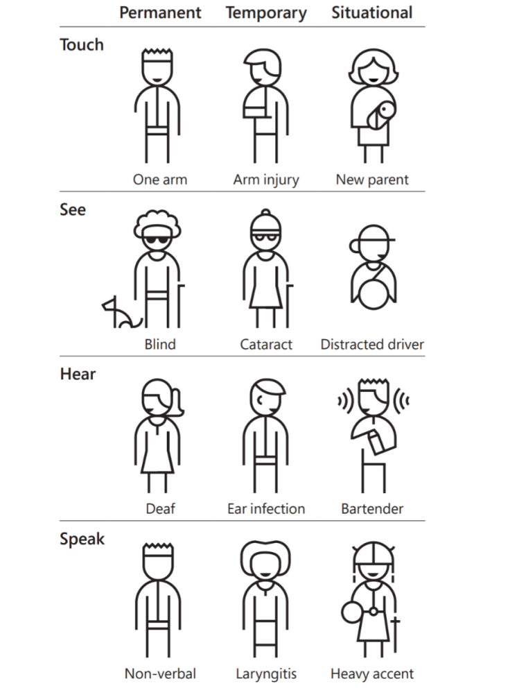
Microsoft’s inclusive design toolkit highlights how we all can benefit from a designer’s focus on accessibility. Here is an excellent table about different types of temporary and permanent disabilities.

One of the many ways to build products for access is to design for someone with color vision deficiency, a condition where a person’s eyes are unable to see colors in normal light situations. People with color vision deficiency have a hard time telling colors apart. A prominent feature of many products is color, but what happens to a button, or another interface element, for someone who has difficulty differentiating colors?
For example, an orange and green color that may appear separate to some could appear nearly identical to individuals with protanopia vision, a type of colorblindness.
Most people who suffer from color vision deficiency are not blind to color but have a reduced ability to see them. However, the most severe forms of these deficiencies are referred to as color blindness.
Color blindness affects millions of people worldwide: it is estimated that 260–320 million total individuals are affected genetically — 1 in 12 men and 1 in 200 women. However, color deficiencies — of all kinds — vary between individuals. The World Health Organization (WHO) identifies 4% of the global population as being visually impaired, 4% as having low vision, and 0.6% as being blind.
There are a variety of classes of color vision deficiency; the most common is red-green color blindness or protanopia. Other color vision deficiencies include protanomaly, deuteranopia, deuteranomaly, tritanopia, tritanomaly, achromatopsia, achromatomaly, and low-contrast.
Color vision deficiencies can be acquired, but most are inherited genetically. The genes that influence the colors inside the eyes, called ‘photopigments,’ are carried on the X chromosome. If these genes are abnormal or damaged, color blindness occurs. Sometimes color blindness can be caused by physical or chemical damage to the eye, the optic nerve, or parts of the brain that process color information. Color vision can also decline with age, most often because of cataract — a clouding and yellowing of the eye’s lens.
There are numerous tools and guides available for testing and planning for stark enough contrast levels to maintain an accessible design for multiple types of reduced vision and color vision deficiencies. If you are using Figma in a Chrome browser, Funkify is a Chrome extension that simulates different types of disabilities. If you are designing for the web, the Web Content Accessibility Guidelines (WCAG) should be referenced.
Check out the World Wide Web Consortium’s (WC3) Web Accessibility Initiative and test your existing website with its evaluation tools.
Experience it yourself: Try using your website without a mouse or with a voice or text browser (free options available online). How was the experience? Attaching alt text to every image in the code of your webpage or app is an additional way to create access to a person with reduced vision, navigating their device with a screen reader.

As you'll see in the Hierarchy lesson, designing simple, well-spaced layouts is already a strategy we're using to focus the eye on the most essential information. Through doing that, you're increasing the readability as well. Readability is critical for every design and can be crucial for accessible design.
Readability can be extended through many different strategies, from higher contrast colors, larger text, shorter line length, kerning, leading, typeface choices, and more, which is covered further in the typography lesson.

Usability
Usability is the degree to which a product or service is easy, intuitive, and efficient to use to achieve specific customer goals.
This is the size of the learning curve to understanding how your product or service works, a lack of required instruction to perform desired interactions, and the time or effort it takes to complete these actions like the number of taps necessary.
An example is the layout of a mobile application on larger devices. There is increasingly a smaller percentage of screen area that a person can reach with just their thumb when holding a phone with one hand. Menu bars and search fields are appearing at the bottom of screens more often to increase their usability.
As mentioned in the What is Design? section, the Aesthetic-Usability Effect comes into play here as well. It’s essential to make your product usable regardless of its aesthetics. But you can use them both together to create a product that works well (is usable) and looks like it does too.

5. Design Research
Research is the stage of the design process when you are discovering problems that need solutions and customers that need helping. Your primary goal is to get an understanding of a group or groups of people’s problems. You will be investigating to understand your customers and the context of their situation, especially as it relates to their problems that you are attempting to solve or offer solutions for.
Based on those findings, you’ll be able to distill some basic information about the product you intend to design into a design brief. From there, you’ll be ready to start establishing goals for yourself, your team, and your product. It’s important to set goals for your product as well as targets for the research phase itself.
While you should focus on conducting research and understanding potential customers and problems before designing, research is not a one-time process. Research should continue before, during, and after the launch of a product. Running tests and researching the behavior of your audience after a product launch is a great way to learn from your mistakes.
Understanding your customers allows you to be an advocate for them, and to create informed and inspired design solutions that best meet their needs. Your research can be an attempt to see the world through their eyes to better understand the behaviors and environments of your current and potential customers. It also aids in avoiding your own biases, as you design for people who aren’t like you.
To begin the research phase of designing, identify what understand and don’t know about your customers and their problems. It’s from here that you’ll be able to base questions to uncover insights, generate new hypotheses, and validate or invalidate your assumptions.
If you identify anything that you don’t know about your customers, make sure to determine how you’re going to learn it. Follow up later and confirm that you’ve filled as many gaps in your knowledge of your customers as you are able to.
Your research goals are to answer: Who are the target customers? Why do they or will they use your product? What are their motivations? What do they expect from your product? How do they currently solve the problems you are targeting to solve? And any questions you think are relevant to you and your product development. Ask open-ended questions of your interviewees. You’re trying to gain insights from them, to get them to open up to you, and potentially share ideas you didn’t know to look for.
Identifying themes will allow you to not only bucket your customer groups but your product and feature offerings as well. For example, if you have the time or resources to develop three features for your product before launch, having identified key themes of customer needs may be crucial to prioritize what gets built and shipped first.
Designers and User Researchers may create prototypes of what a final product may function or look like to test potential solutions without committing the designs to an extended development process that may be required for the product when it’s eventually built.
Creating these prototypes, via paper, prototyping software, or even coded applications is an excellent strategy for testing and iterating on ideas earlier in the design process. This is often the process within design sprints.
There are many methods to learn about your customers and potential customers firsthand. From customer studies, one-on-one interviews, and surveys. Additionally, there are secondary sources including everything from research firms like Pew Research Center to understandings gained from competitors.
Firsthand Research
As you explore solutions to your problems, you will interview your customers, and likely want to test your proposed solutions to see if they solve your their problems. It doesn’t even have to be a lot of them. Any amount of individuals to gain some insight, and learn things that you don’t or can’t know yourself. You are not your only customer.
This interviewing can happen face-to-face, in your office or where your customers are — which is always preferred. If you are building a product for grocery store shoppers, you will want to go to a grocery store and talk to individuals shopping there that are willing.
Stop looking at what other companies are doing. Start spending more time with existing/potential customers.
Connecting with your existing and potential customers can be extremely helpful in focusing your design efforts and informing your decisions. Interviewing customers individually and in focus groups for gathering insights, in many companies, is the role of not just the designer, but also a User Researcher or team focused on User Research.
When conducting research consider what people want from your product. You have to ask questions that give you an understanding of their past behavior. Asking them directly what they want from your product often doesn't deliver helpful insights. Focus on how they have dealt with or confronted their problems previously.
Not all research requires access to your customers directly, you can send them a survey, schedule phone calls, and even write them a letter. Be creative on how to best contact your customers. As you better understand them, you will hopefully better understand how to contact and learn from them.
If you are struggling to find customers to interview, start with your own network of friends and colleagues that may fit the profile of your potential customers. Also, consider an immersive trip to where your customers are.
Secondhand Research
An excellent secondary source of information is to look toward other successful products in your field or industry. Create a mood board to get inspired by products that solve problems parallel to the issues you’re addressing. Ask yourself, “What makes this design solution successful?”
Comparing your product to a competitor’s product can be helpful, but be sure not to copy their designs. It is great to gain inspiration, but you don’t want to steal, nor do you want to take a solution that may not be as successful as a solution you can come up with on your own.
Examine the content from your competitors to understand what tone they use to communicate with their customers. Look for limited feature areas where your product may excel. This is a great beginning for identifying what you would change about it.
Many research organizations publish their findings, and they may have already done research on your customers or similar products.

Beyond researching externally, there is also the examination of your own products as they are used. You can monitor your products analytics and test different solutions to a problem through experimentation or trial and error. In digital products, this is called A/B testing, where subsets of your customers are presented with different experiences and metrics on their usage are compared.
Research goes beyond understanding just your customers and their problems. You also need to understand the organization you are serving, be it in-house or a client. The better you conceptualize how they get work done, what the business goals are, and even how the business makes money, then you’ll be in a better position to innovate.
Your teammates may have experience working with or even being your customer. Uncovering their goals and intentions will help you guide the project, serve your customer, and collaborate together.
Don’t forget to share your research across your team and ensure that they are doing the same. The shared understanding of what your goals and audience are will help drive a unified product within your organization. Even if your team may be just you and one developer.
Research Tips
- Start with the questions you want to be answered.
- Get feedback from your current and potential customers early and often.
- When interviewing customers, explain why you are conducting research and what you are hoping to learn.
- If possible, talk to your customers in their own environment rather than bringing them to your workspace.
- Get consent from any participants of your research.
- If possible, offer interview participants compensation for their time, even a gift card or some other recognition of their time and thoughtfulness.
- Try to avoid your own biases.
6. Content
As you’ll see when we dive into wireframing, there are benefits to starting with no content, or even fake content, and keeping only the customer experience and layout in mind.
But, with this method, you’ll start to notice that your design mocks don’t match up to your finished app with real customer content in them. Lines of text might be longer than the space allotted to it in the design files
Designing with real customer information, and as close to final content is always the best case scenario. This is so important that if you were to create a webpage right now, I would recommend that you spend many hours working on the words themselves that will be on the site before you open up a computer.
It’s essential to map out the types of things you want to tell people. You’ll quickly find yourself blindly designing pages that might not be necessary, or even duplicate others that already exist. This process helps uncover considerations you might otherwise forget, and understand the overall flow of your product.
Writing copy is hard, I won’t lie, which makes it one of the most overlooked parts of the design process. Like Viba Mohan pointed out, however, it’s often the ‘neglected middle child’ of design, because lousy copy is able to ruin the entire experience of your design for a customer.
The easiest way to improve at writing merely is by doing it. Practice writing regularly, either for your app or maybe as a personal goal–tools like 750 Words help you learn to build a habit of writing every day just for the purpose of improving yourself.
If you’re a bit beyond that, these some general tips we’ve gathered from our writing friends that you may find useful: - Write things that you would only say to someone out-loud, in person - Keep your writing as simple and clear as possible - When you’re writing, say everything you write out-loud before signing off on it - Avoid jargon at all costs - Less is more
The timeless book, On Writing Well by William Zinsser, is a great resource for learning the art of writing and knowing when to say less:
Examine every word you put on paper. You'll find a surprising number that don't serve any purpose.
When writing gets tough, remember this: you’re creating something, and the most powerful tool in your kit is the words your app shows. You don’t need to nail it first time, but make sure to invest in a good starting point — first impressions count.


To start designing you don’t need the final copy, but you do need to know the content that will be used. What sections will you need? What is the general message that the paragraphs will say? You can use placeholders in your designs too. You're indicating what is going to be there with the intent to replace that with final content later on.
Both understanding what content is coming and using placeholders can be helpful in establishing hierarchy, blocking out content areas in your designs, and visualizing spacing.
It's important to clearly communicate with developers, stakeholders, or any other content reviewers that the placeholders are not the real content. If your temporary text, imagery, or other objects seem too developed, then it may be mistaken as actual content and critiqued as such. Clear communication is vital here.
Additionally, as you gather content, keep in mind that you don’t have to create everything yourself. There are fonts, icon libraries, photography resources and more available online. Just remember to use them legally and, when required, with the creator's permission.
7. Storytelling
UX design, or User Experience design, focuses on the experience your customers have as they move through your product. This most commonly applies to digital design, but it is no different in concept than interior design, for example. How a customer enters, walks through, and leaves a business is the physical equivalent of the UX of your app or website.
Start with the customer journey, for example: Your customer is shopping for a pair of shoes. What will they first see when they visit your website?
The customer may ask themselves: Will I know where to go? Is this website the right place for me? What is this site? Who can I ask for help? How long will this take? Will I be able to return the shoes if they do not fit? Can I trust this retailer?
These are all elements of their journey and should be considered when designing a solution, particularly the order in which they arrive at these answers and how smoothly they can progress to the next step.
Books begin by bringing the reader into the experience; the stage or location of the characters, and the lives of the characters themselves. If the reader doesn’t feel engaged with these elements, they likely will not keep reading.
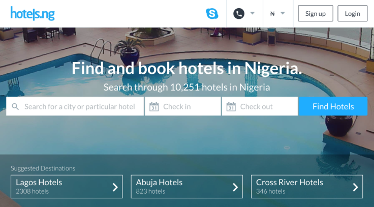
Welcome your customers to your website with common courtesies. Introduce yourself and what you are offering. For example, hotels.ng introduces itself with the text, “Find and book hotels in Nigeria.”
Think of this as similar to having a guest in your home. You want them to come, see your home, eat, stay a while, and leave knowing they had a good time. If they loved it, they’ll likely come back and visit again. They may even invite other close friends with them as well.
You want to organize your product for your audience so they feel welcome, and comfortable in your digital space. Introduce them to who you are and what your products are.
Here is a formula of basic elements that you may experience with some of your favorite e-commerce sites:
An introduction with the logo and name of the site and/or product, plus a welcome. Then featured products that represent the category of offerings. An easy to navigate journey that is a comfortable, simple path through your story: selecting a style, picking shoes, customizing size and color, adding to cart, checkout, post-purchase experiences, receiving their product, support for them. Experience when they return or send their friends.
When thinking through this process, remember you don’t need to try and arrange all of this information on a single page or screen. Otherwise, it might become overwhelming.
Consider that your experience unfolds over time, like a story: reveal information about your site’s security or information on shipping speeds only when relevant — as the customer needs the information.
Design is just as much about the things that you choose not to include as it is about the things you do, with each element telling a story of its own.
You’ll find that crafting a narrative around your products is not just helpful to getting and maintaining customer happiness and loyalty, but is crucial to defining and defending your design decisions. If you are working with team members or clients or other stakeholders, you will need to explain why you designed the product the way you did.
Communicating through storytelling is a powerful way to share decision-making as well as build customer empathy — and validate your assumptions in the process.
If you’re working with others on developing a product, it’s crucial that they understand the customers and their needs. Getting approval can also depend on how your teammates or collaborates understand what decisions you’ve made and why.
Much like with prototyping — often used to share how an experience works beyond what you build with pixels — sharing the story makes the holistic experience easier to grasp.
8. Simplicity
One of the key elements to consider when designing is simplicity. As you are addressing a problem, simplifying the customer’s experience is essential. Simplicity in design can reduce the level that your customers may be intimidated by it. This is especially the case with technology products or services that handle health, money, or long-term decision making, where your customers may already be experiencing stress.
Communicating a message clearly and quickly to your audience will help you better serve them. With a clear message your product will seem, and hopefully be, more meaningful to your customers.
Often, creating something simple is more difficult than creating something complex. However, simplicity in design is not necessarily the opposite of complexity, but the revealing of the complex information in a measured and easy to digest way.
Consider a presentation or a movie. Elements are revealed over time, continuing to build on each other to create a more complex idea. Taking a lot of information and breaking it into pieces for your customers to digest, can convey large amounts of data.
As we’ve covered in the research lesson, one of the first steps to designing is defining what your customers’ goals and problems are. From there, designing an interface with those considerations in mind, you can help your customers accomplish their goals with the most straightforward means.
By doing the research to understand your customers, you can use that data to design a product that lacks elements that are inconsequential. Focusing instead on crucial information with limited distractions. If all unnecessary information is stripped away, it leaves your customer with the essentials required to solve their problems.
For example, this Photos application by Google is trying to solve several problems, but hides the non-crucial information behind a menu, or displays that information in a contextual situation. The customer is presented with just their photos and search bar.
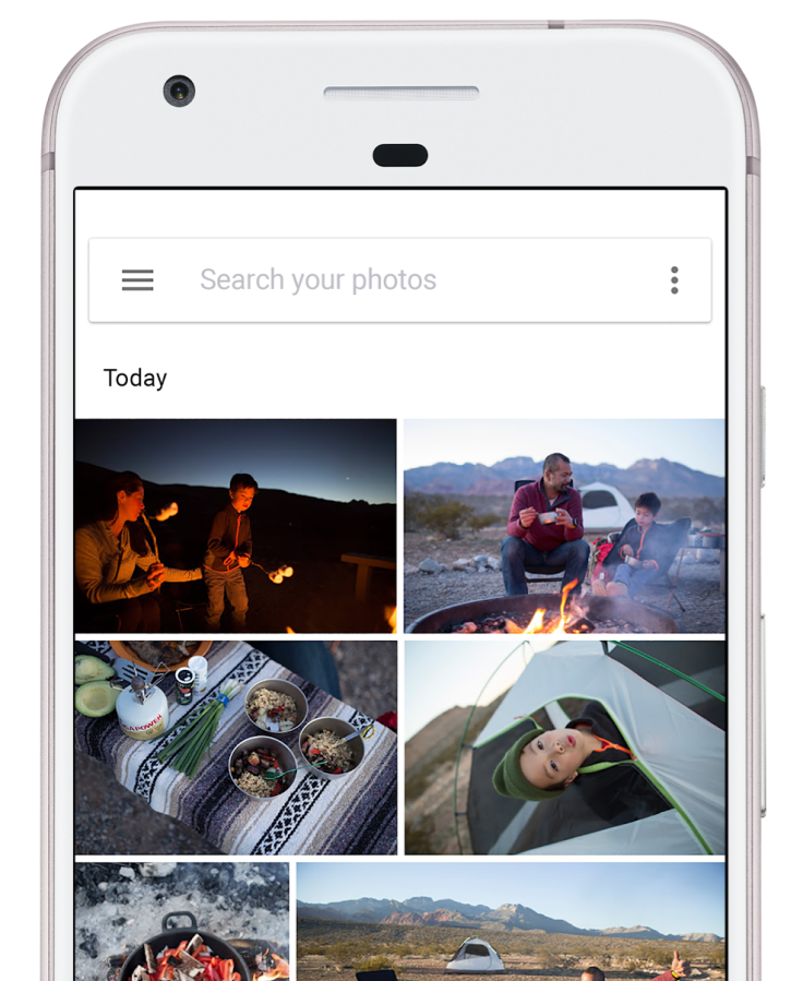
Likely the two things Google’s customers are looking to solve when they open this app: 1) I want to see my photos, and 2) I want to look for a specific moment.
The app goes much further, trying to solve a variety of problems, like sharing, sorting, and even automatic organization; the app also offers some machine learning-aided options for surfacing specific images, such as pictures of animals when you search “pets.”
Another way to maintain simplicity is to use the benefit of existing paradigms and visual languages that your customers may already be used to. As you may have noticed, there are a lot of landing pages or pricing pages across many companies websites that look similar. That can be caused by many things, but it’s likely a result of 1) trends, 2) design systems, and 3) that it is often successful.
Design patterns can become popular across multiple products and companies. Individuals don’t always create original designs in a vacuum. As we’ll experiment with, in this exercise, creating a mood board for inspiration is common practice, and the research of similar problem and solution sets is used to understand how other designers have tackled these challenges.
A lot of what is created can be dictated by the language of design systems, like Material Design by Google and Apple’s Human Interface Guidelines, and patterns created through popular usage. A design system is a series of components and elements intended to be reused in different combinations to maintain consistency across products and teams. A design system can help manage the designing and building of products and interfaces at scale.
Facebook popularized the hamburger menu. A visual metaphor for the rows of options seen in application menus, it’s an icon of three horizontal lines.

It doesn’t necessarily occur to every customer of Facebook’s what the lines represent, but it has been used on their platform for a long enough period of time that their customers have become accustomed to tapping that icon to see options. Facebook has such a large customer base, that other applications began adopting the hamburger menu, knowing that their customers may recognize it too.
Facebook didn’t invent the hamburger menu, but they most likely are responsible for popularizing it. The meaning of icons can be lost in translation too. Iconography is developed from common understanding, thus the success—and sometimes failure—of emoji. Not every culture represents objects or experiences the same way.
There’s no need to reinvent the wheel. One way to maintain simplicity is by maintaining conventions. A significant amount of mobile device customers learned the hamburger menu through Facebook and other apps that use it so you can use it in your app without redefining what a menu icon looks like.
Another way to heighten simplicity is to increase white space. This is the space between elements. It allows customers to focus on individual objects, without the distractions of what’s surrounding it. In a later section, we’ll dive deep into Gestalt principles, or how the eye moves around a design. One of the elements of guiding your customers around is the open space around objects. Keeping lots of space around a button makes that button easier to find and tap.
Simplicity is a balance between reducing noise and obfuscating necessary information. But there is a risk of oversimplification. A good rule of thumb for app design: can a customer perform a standard action (the action they often come to your product in the first place to do) within three to five taps.
9. Consistency
Building and maintaining a consistent experience in your designs, products, and systems can have great consequences for your customers and their experience.
Customers become accustomed to specific interface objects and even the location of those objects on a screen. This makes the experience familiar, and your product becomes more straightforward to use.
This includes establishing the colors, typefaces, and tone of a product that can be used across many types of layouts and interfaces.
Cohesiveness
The experience of your product should be cohesive, with a continuation from one element to the next like the way a book is structured. Every visual element cues the audience that you’re still in the same story, moving from chapter to chapter. Keeping colors, fonts, and alignment consistent helps your audience focus on the plot.
This goes back to our discussion of design patterns in the Simplicity lesson. Maintaining the locations of objects, like the menu button in one of the top two corners, is a design pattern establish in many products and one you can build in your product too. If your customer can already tell how your product works because it works like other products they are familiar with, then they don't have to spend time learning your interface.
People become accustomed to existing patterns, and our brains are optimized for recalling and repeating patterns. We build a shared understanding of how specific products work and then have an expectation for how similar products are supposed to work. This intuitiveness is based on design patterns across the design industry and is one reason to keep looking at other products and designs to see how they are solving problems.
These patterns are also seen in common design systems and are a benefit of Google's Material Design and Apple's Human Interface Guidelines. Establishing elements that many app designers use creates consistency across thousands of applications.
As you establish a mood and tone to your designs, you’ll want them to feel consistent as well. A continuation from one screen or product to the next, as if one voice is talking to your customer. If I click on a link on your website and the next page feels radically different, I may think that hyperlink took me to another website and not another page of the same site. If your homepage is airy with a lot of white space, your product page shouldn’t be dense and content heavy with little breathing room. As your audience discovers new elements, they should instantly know that they are still using your product.
This expands to the tone of your interface copy as well. Your writing should remain consistent with your product. If your product is geared toward an enterprise audience and your homepage or landing screen describes the product in a formal, professional way, then the other pages or screens in your product should not be casual in tone and full of puns. A great example of a guide for this is Shopify's Voice and Tone section of it's Polaris design system.
The consistency of an experience is also essential when it comes to the sharing of your product. A customer may have a great experience using your app to order groceries or buy a product. So much so that they evangelize your product, telling their friends how great it is or how beautiful it works to solve their problems. If those friends then come to your product and don't have that experience, that is an inconsistency too.
Colors and Fonts
A rule of thumb is to use two or three styles of type across an entire product, like a website or app. Using more than that can make a product feel unstructured or busy, and can be distracting. For colors, a great starting place is one primary color, one secondary color, and a few tones of those colors, plus black and white. Using more colors in complex systems can work successfully, but it becomes more difficult with each addition.
As stated above, consistency has a lot of benefits, so using additional typefaces or colors can be used for differentiation but should feel like it fits within the experience.
Alignment
One of the easiest ways to make a document or interface look and feel well designed is consistency in where objects sit in space.
Say your app screen has a title and it is 100px from the top of the frame or screen. You want all the other app screens with similar titles to have those titles in the same place.
Guides and measurements are your friends here — just click and drag from a ruler in Figma to create a guide, and hold the Alt key when an object is selected to see the distance to the objects around it.
Consider the left side, or left vertical margin, of a website, poster, app screen, infographic, etc., containing a logo, an image, a header, and some body text. Aligning these elements to each other will make it easier for the eye to move down the page, but also makes the layout of this content seem considered and intentional.
Inconsistency
You can also use a break of consistency to your advantage. We avoid distraction so that our interface can get out of the way of our customers using our product. A lack of consistency can be used to create emphasis an attract attention. Our brains detect patterns and signal your attention when what is happening in front of your eyes deviates from the expected pattern.
An example is indenting a quote block to further emphasize it. One thing to keep in mind when considering types of emphasis is to limit the amount of them. A bold, red, italics, larger block of text is not really necessary if you are also indenting it. And remember: if everything is bold, nothing is bold — the amount of what you emphasize is essential too.
As we’ll consider in the upcoming Hierarchy lesson, this creation of emphasis is a tool that is used to draw the attention of your customers and aid in your customer flow by guiding where their eyes move and which details they may remember.
Consistency is often broken, and it will happen frequently. That's okay! It's more important to understand your customers' needs and solve their problems than maintain a consistent product. If you are only paying attention to a rigid system, you might not address those problems. It's a balance.
10. Constraints
Constraints are limitations on the designs and products you create or the processes you use while making them. They can significantly help you develop ideas — and they come from customers, stakeholders, or are even self-imposed. Within these limitations, it’s possible to be inspired to find great ideas or solutions; to narrow the possibilities for entry points into the design process while allowing for the quicker production of work with fewer options.
These creativity guardrails can help focus the design work and process. With no limits, there is are unlimited possibilities, similar to the effect a blank canvas can have. Consider the intimidating, infinite canvas of a blank sheet of paper or an empty frame in a new design file. When there are no boundaries, sometimes it becomes a boundary itself. Constraints can be a significant forcing function to remove these creative limits.
Arguably the most common constraints that designers face are the problem sets you’re trying to solve for specific customers, timeline or deadlines, and budget or financial resources.

Another common constraint is the size of an intended device you are designing for. If you know you are creating an app screen for a phone, then you’ve got a starting place. And with that you know you are constrained to using bigger text with shorter line lengths. But other constraints come with designing for a mobile screen, such as the file size of images, videos, or the application itself. Your customers may be on a network connection that is slow and expensive, with bandwidth limitations and data caps.
There are always limitations based on the materials that you are designing for. Print materials may constrain you to use a particular color spectrum, or have requirements relating to the margin and bleed of the physical paper. If you’re working in the print industry, there are likely file format requirements for your deliverables and software that you may have to use that are specific to printers and their color profiles.
If your intended audiences are kids, non-technical individuals, highly-technical individuals, people who speak or read in multiple languages, etc., you may need to adjust your designs accordingly. You’ll need to limit your text line length and color contrast as you consider accessibility (which you must always), as you know individuals with dyslexia or color vision deficiencies are your customers.
You may be constrained with colors outside of accessibility considerations through set corporate styles or brand guidelines. Those corporate guides may also come with business requirements such as retention metrics and growth goals. You may deal with internal politics, your reach of authority, and access to resources inside an organization as well. Your own or your team’s research skills could be a limiting factor in serving and advocating for your customers too.
Your customer-base will have different levels of literacy and various native languages. Some languages are written and read from right to left so your product will need to be designed that way as well.
Of course, the development of what you design is a constraint. That’s why there is an ever-controversial discussion in the design community of designers learning to code. If you understand even some fundamentals about how your designs are built and become products, you may start designing your layouts and interactions differently with those limitations in mind. It’s just like how you begin to understand the design language of a mobile platform, like Apple’s Human Interface Guidelines. You get familiar with it, and design within its constraints to increase the usability of your app, making it easier to learn for your customers because they already know how an app on iOS should work.
Often there are constraints that you choose on your own, like signing up for a 100-day design program, constraining yourself by time, assignments, and perhaps some accountability within an online community. The brief or scope of work is in itself a constraint. It may state that the solution to your customers’ problems may need to have specific capabilities or features.
Whatever a constraint is, view them as a positive and constructive framework for designing, as they help you find solutions faster and better, that meet the needs of your customers.
11. Hierarchy
Hierarchy is the organization or presentation of elements in a way that suggests importance. The arrangement and emphasis of visible elements influence the order in which the human eye perceives what it is seeing. This order of dominance is created by the visual contrast between objects and the principles of Gestalt philosophy.
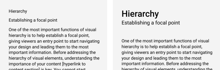
Establishing a focal point
An important function of hierarchy is to establish a point of focus by giving your customers an entrance point to begin navigating your product and leading them to the critical and pertinent information. Before addressing the hierarchy of visual elements, understanding the importance of your content is key. You cannot start prioritizing the appearance of any elements until you understand what is the most important to your customers.
Creating hierarchy through contrast and scanning patterns
Contrast is the difference between two things to the point that attention is drawn to the difference. Contrast can be created with color, typography, spacing, shapes, and more. These basic principles are used to organize and prioritize your content.
The prominence of some elements over others is an effective way to guide your audience through a story. For example, the title of a blog post gives context as to what the reader is going to get out of the body text. And to an extent, that title is there to convince the reader to read the post, continue down the page, and even continue reading to another post or page. The title, or heading, is often at the top of the visual and information hierarchy of most pages online. This is the typographic hierarchy of text elements, a fundamental organization of information on the internet.
The heading, subheading, and body text of almost every text-based web page is organized this way and is used to help tell the story of the page. The heading, or H1, is the most prominent object in the image below. Followed by the subhead, or H2, and then the body text. The heading and subheading are there to provide context for what the viewer is about to read. By giving it visual dominance, an entry point for the eyes is created, followed by a clear path for the reader to travel.
By separating the different elements visually, it is easier for your readers to see the individual parts and move through them in a specific order — an order of your choice.
But creating a linear route is not the only option here. You can use contrasting elements to move the viewer's eye around a screen in many directions and patterns. Some commonly used conventions are "F" and "Z" scanning patterns, named after the shape created if the viewer’s path across a page where drawn as an overlay on a design.
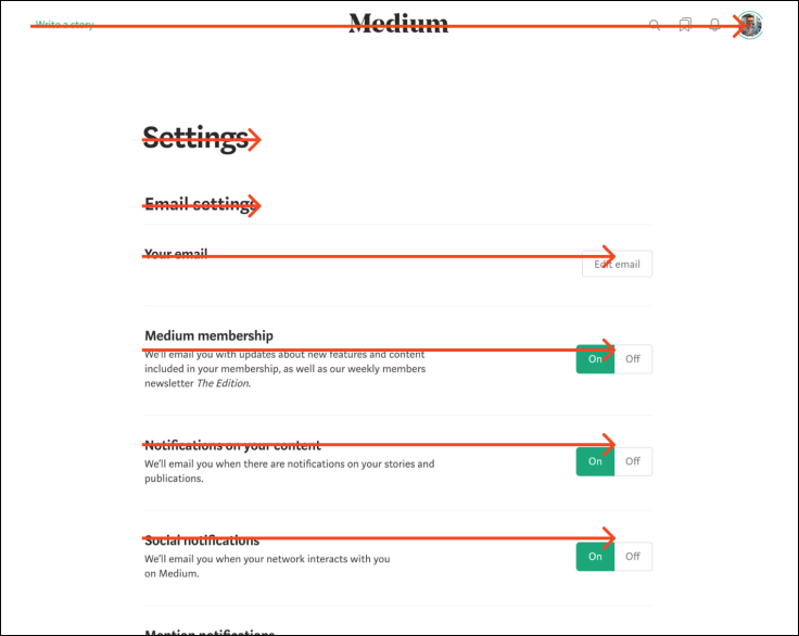
“F” or “E” patterns are generally used for forms and dashboards, or text-dense pages like articles and blog posts. The previous image is from Medium’s account settings dashboard, with the scanning pattern on top of it in red.
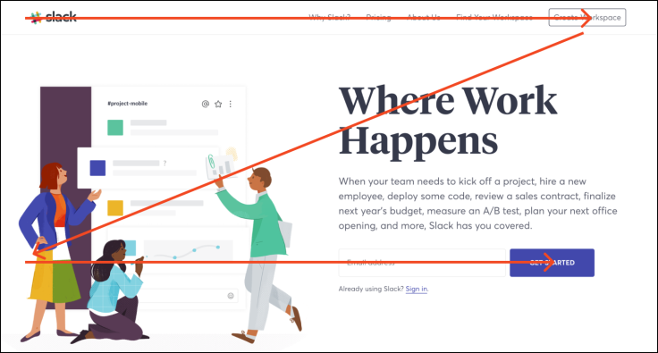
The image below is from Slack’s homepage, which takes advantage of the “Z” pattern to place two call-to-actions, Create Workspace and Get Started, within the path that an eye may travel across this page.
Other ways to draw attention from your audience, and guide their journey through your design is to use color, size, type style, shapes, spacing, and other elements of contrast.
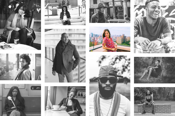
For example, emphasis can be created with tints of color, shown in the grid of photos below. If all but one image are black and white, then the color image demands more attention.
Gestalt principles
We've established that hierarchy is used to prioritize visual elements to organize information into recognizable patterns. Gestalt principles, or the principles of grouping, are a psychological understanding of how we as humans interpret visual information and the elements that affect those perceptions.
Our minds identify patterns in what we see and experience. Psychologists group these perceptions into five categories: Proximity, Similarity, Continuity, Closure, and Connectedness. Since the original definition and categorization of Gestalt principles, there have been additional categories identified:
Proximity is the grouping of multiple items near each other. When objects are close to one another, we believe that they are related in some way. Use more white space to separate dissimilar objects and reduce white space to link elements.
Similarity is the associating of elements based on something they have in common, such as shape, size, or color.
Past Experience is the understanding of what is in front of someone based on what that person has experienced in the past. The brain identifies patterns across time and place based on the previous exposure to the object or pattern.
Continuity is the repetition of a pattern or theme. Similar to Past Experience, but can include all new input.
Closure has a pattern with an incomplete object, that implies the pattern continues outside a composition.
Connectedness is when two or more objects are in contact, with either direct contact or connect through another object like a line.
Simplicity is our preference for objects that are simple, ordered, and clear. Complex shapes are broken down into basic components like squares, circles, and triangles to reduce complication.
Figure-ground relationships are meeting of white space and negative space to balance or unbalance a composition.
Symmetry is a mirror image or layout, where if a line was drawn down the middle, perhaps horizontally or vertically but possibly on a diagonal, the layout is the same in each direction outward from this dividing line. It often implies order and balance in a composition.

Summary
You can't emphasize everything. If everything is bold, nothing is bold. Use these elements of contrast and Gestalt selectively and with a purpose to draw attention to what is most important.
If you are unsure what element has prominence: close one eye, step back from your screen, and unfocus your vision. You can also step away from your design for a day or two to gain perspective. And one of the best ways is to show your design to another person and hear from them what elements they are drawn to first.
12. Typography
Working with type can be intimidating, with tons of choices, potential use cases, and terminology rooted in the print industry.
If you are coming to design from anywhere but a printing studio it can be hard to catch up quick. This is an introduction to the typefaces, color contrast, alignment, readability, text hierarchy, and more, that you can use to start laying out type successfully.
Typography can evoke emotion and convey an intention or message in itself. Often, a goal of a typeface is to communicate “non-verbally,” providing visual information about the tone of the brand, project, company, or the information contained within before the text is read. For example, Cold Type is a term that refers to a typeface that appears unwelcoming, administrative, or uninviting.
Typography is about clear, quality communication with readability being a critical factor when setting type. Good type can create aesthetically beautiful products and designs that are also usable.
There is a lot to learn and understand about type. And there are entire books dedicated to typographic styles and using type on the web. Let's dive into the two most common questions we hear from new designers are:
How do I pick a typeface?
How do I customize that type?
Picking a typeface
Typefaces are often chosen for what they say before the words set in them are ever read.
Companies usually select typefaces for their brand to match their style or desired customer perceptions, often with the goal of seeming approachable and trustworthy. The right typeface will be a response to the project brief itself, aesthetically and functionally. Some typefaces work better for headers than menu text or have large enough font families to incorporate international scripts, glyphs, and other special characters.
Since you may have started a project by writing or gathering content, it’ll be easier to determine the voice and tone of your type as well. If you know what you want a product or brand to say and sound like, you can echo that with the visual cues of a font.
If a brand's tone is intended to be professional — and not light-hearted — then a serious typeface that has a limited amount of decoration or extra flourish may be a good choice to imply that tone before a viewer even begins to read.
Which of these two examples seems more professional?
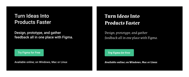
Roboto, on the left, looks cleaner and provides a sense of sterility, perhaps more identifiable with corporations. Almendra, on the right, is based on calligraphy, and doesn't represent the Figma brand appropriately.
A typeface that is too sterile may leave your viewers uninterested in reading long-form text. And one that is too playful may be distracting from your message.
It is definitely a balance, and one of the reasons there are so many different typefaces.
A lot of typeface preference is subjective, but you can help pick your typeface for its destination: Where is it going? (Print, digital, or both) And who is it going to? (Identify your audience). It’s also worth considering your comparative research and mood board if you’ve started there.
A mood board might show you that you’ve already begun to consider a visual tone, and looking at comparable solutions during the research phase may demonstrate how others approach similar problems as well as identify patterns or norms expected for the intended destination.
When exploring typeface options, you can start with the fonts on your computer, or hit the internet and head to one of the many font finding sites, like [https://www.figma.com/google-fonts/](Google Fonts).
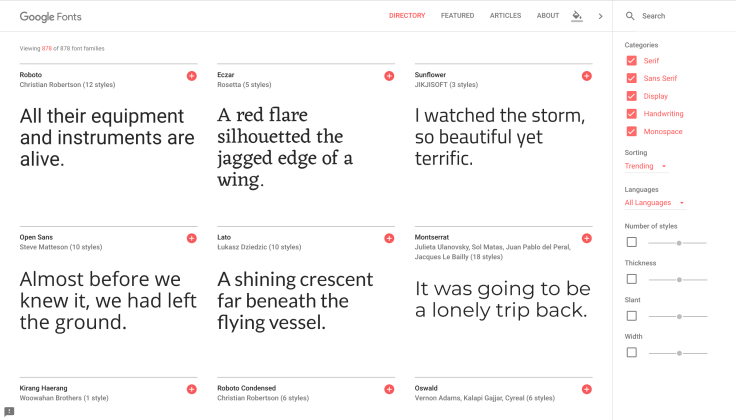
As you browse a font collection, flag any fonts that seem to you to be on-brand or appropriate for your project but also grab your attention and stand out visually.
You're looking for the overall construction of the letters (x-height, cap height, counters, apertures, etc. More on type anatomy below), ability to scale, legibility, personality, and decoration are all elements that help influence the overall look-and-feel of a typeface.
Once you have some fonts picked, try applying them in different situations — especially those similar to what you intend to use them for in your project.
Here is a Figma file with a few type options to try out a font in. Once you open the file, change the text to the left to see it reflected across the page and app screen.
The Figma file above is a great start for exploring new typefaces. Once you start working on a project, testing new typefaces with real content is the best way to choose an appropriate typeface for that text.
If you aren't currently working on a project, then this is an excellent opportunity to identify a website or app that you love and use their content to try out new typefaces.
Once you have some content written, or have found another product to copy, start with the name of the product or brand and change it to a typeface you tested in the exploration above. Make sure to try it in a few different sizes, seeing how it looks small and large.
If it doesn’t look right — with the meaning of the word or name set in that typeface — it’s probably not the correct fit. If it does seem right, then continue testing by applying some other colors.
Set the text to black with a white background and white on a black background. If you’ve already selected or have been assigned a primary brand color, adjust the text to be that color and again examine with a white background and a black background, then white text and black text on a background of your primary brand color.
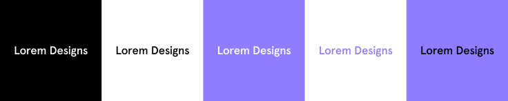
We’ll talk much more about color in the Color lesson, but there are some specific ideas to focus on when it comes to your text. As highlighted in the Inclusion lesson, it is crucial to make your designs accessible. With type, a common issue is that there is not enough contrast between the type and its background, usually a solid color, a gradient, or an image.
Having subtle, light text on a similar background is, unfortunately, a popular style. But this lack of contrast can make text hard to read for not just individuals with low vision, but for everyone.
The Web Content Accessibility Guidelines has set a grading standard for testing contrast on the web. This includes a score and a ratio.
There are many tools available for checking the contrast ratio of two colors, some are listed in the Inclusion lesson; for macOS, there is a great menu bar plugin called Contrast. The scoring set in the Web Content Accessibility Guidelines for contrast ratio is:
Fail, a ratio of less than 3.0; the text doesn’t have enough contrast with its background, rendering it illegible or hard to read. A 0 on the scale is white text on a white background, which is no contrast at all.
AA Large, a ratio of at least 3.0 is the smallest amount of contrast for type that is 18px or larger that is acceptable for usability.
AA, a ratio of at least 4.5 is a goal for any text below 18px, the same ratio as AAA Large.
AAA Large, a ratio of at least 4.5 for any text larger than 24px, or 18px when bold.
AAA, a contrast ratio of at least 7.0 is ideal for long-form reading or other large amounts of text and is achievable if your customers can set the foreground and background colors themselves. The scale goes to 21.0, which is achievable with black text on a white background.
For readability, aim for the highest score possible, with AAA being the best.
This is important to understand because if you are going to spend the time finding the right typefaces for your project, that work with the colors in your designs, it’s best if people can see them.
All customizations for the purpose of accessibility can also make your text more aesthetically pleasing and increase the effectiveness of your messaging.
You can also increase readability by changing the size, weight, and spacing of your text, or the change the typeface entirely. This increase of white space can also help to reinforce hierarchy.
Combining typefaces can also increase hierarchy, visual interest, and give you access to more use cases the way that a large font family might.
Just like working with color, it’s best not to involve too many typefaces, 1–3 is ideal, for any design — especially an app or webpage. Think about the consistency of spacing and alignment: keeping designs consistent with font choices can also help a design — and story — read clearly.
Customizing Type
There are many elements of type that you can adjust as you design. Changing these parameters can help you fine-tune the look, legibility, and mood of a character, word, line of text, or product.
We just covered a bit about color above, which is one of the most commonly altered elements of text. The upcoming lesson on color will go into much further detail about how to choose colors, but always keep in mind increased contrast for greatest readability and accessibility.
Similar to color, the opacity of text can be altered. This can be helpful in creating similar colors without diving into the color palette at all. Setting a background to blue, and then a black type with 40% opacity would make the text appear light blue in a similar hue to the background color.
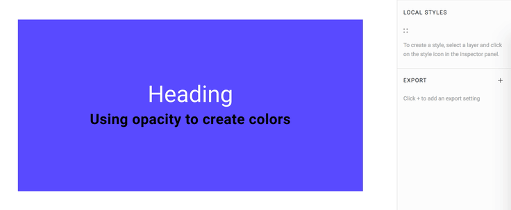
Kerning and Leading:
The spacing around letters and lines of text are commonly edited by a designer to increase legibility, add more white space, and to alter the aesthetics of a page or screen. There are many ways to change these typographic spaces.
Fonts are constructed so that any two or more characters can be placed next to each other. Sometimes the space around a character is set in a way that it looks further apart or closer together to its neighboring characters.
Kerning is the process of adjusting that spacing between letters to make the distribution of letters and the space between them appear even. Increasing or decreasing letter-spacing so that the characters in a word, wordmark, or line of text look evenly distributed optically. In many creative tools, including Figma, you can adjust the letter-spacing. Here is an example of editing the kerning of a word:
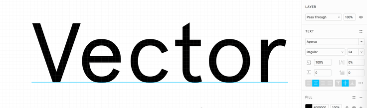
The goal is to make them seem evenly spaced when looking at them, and often a designer will move letters closer and further apart to give that appearance. It takes a little time, but as you design more and more you’ll develop a better sense for proper kerning.
Leading is the adjustment of space between two lines of text vertically. Increasing or decreasing line height can help to improve or reduce readability. Leading is measured from the text's baselines. Generally, setting the line height between 1.125 and 1.200 times the font size (112.5%–120.0%) results in readable text, but every typeface has nuances — including line-spacing.
Long lines of text, bold set type, type set at small sizes, and sans serif typefaces may require more leading.
Weight and Style:
In a typeface, for example, Montserrat by Julieta Ulanovsky and studio, there are multiple styles and weights — such as regular, bold, italic, thin, black, etc. — and each has a font. A font is a file for installing and using a set of type in a particular weight and style. A typeface with multiple weights has a font for each weight, together they are known as a font family.
The typeface Montserrat has a font family of 18 fonts: Thin, Thin Italic, Extra-Light, Extra-Light Italic, Light, Light Italic, Regular, Regular Italic, Medium, Medium Italic, Semi-Bold, Semi-Bold Italic, Bold, Bold Italic, Extra-Bold, Extra-Bold Italic, Black, and Black Italic.
Weight refers to the thickness of a letter’s stroke. A typeface can range in weights from hairline to ultra-black and have many fonts in between, while some typefaces may come in only one weight. These weights also have a number association, which is helpful to understand when programming or collaborating with a developer. Weights generally coordinate to a number on a scale of 100 to 900, with intervals of 100: Regular 400, Medium 500, Semi-Bold 600, Bold 700, etc.
Font style is the adjustment of the characters or case, such as italics and all caps respectively. Some typefaces have no style option, and sometimes only offer a Regular weight.
Letter case also referred to simply as “case,” is the distinction between smaller letters like lowercase and larger letters like uppercase or capital letters. Most typeface sets have letters in both, while fonts like Bangers are set in uppercase only. Typefaces set in only uppercase or only lowercase letters are far less common.
In English, the various case styles are used differently, depending on the circumstances:
Title Case, is a Mixed-case Style Where All Words in a Sentence Are Capitalized With The Exception of Articles, Short Prepositions, and Conjunctions. These Exceptions Are Somewhat Subjective.
Sentence case is what we’re used to seeing text written in, including this sentence.
ALL CAPS is when all text is uppercase and is commonly used for headings, wordmarks, button text, or other types of labels. Use it for emphasis, rather than long-form text where the lack of ascenders and descenders can make it hard to read in large quantities. All Caps is also used online to imply yelling, so avoid using it in chat- and conversation-based interfaces.
Small caps are similar in form to capital letters but are as tall as the x-height of the typeface. Small caps are used to distinguish from body text and heading text, however, they are not offered in many typefaces.
all lowercase text is a stylistic choice used in some products and wordmarks for aesthetic purposes.
Size:
Setting and changing the size of type can be a difficult decision. It will depend greatly on the medium that the text will appear, like paper or mobile phone or billboard, and can change depending on the viewer’s device, or responsiveness of the design.
It’s important to determine hierarchy with your type choices, using size as one of the elements of emphasis.
In web development, some key sizes need to be defined, such as the heading, subheading, body text, menu and footer text, etc. A lot of designers start with the heading size, also known as the H1, but it may be helpful to begin with the body text size, as that is how front-end developers might implement it. When a developer works in ems, a unit of measure based on scaling, the body text size is 1em and every other text size is a multiple or fraction of it.
For example, a common body text size for the web is 16px. The H1 may be set at 3em, or three times the body text size, in this case 48px. As the web page is going to be designed for multiple screen sizes, the designs you create may call for different font sizes depending on the customer's device. The developer can have the body text size change with the browser dimensions of your customer, and all other text will scale accordingly.
Details:
A lot of typography is the little details and nuance.
For example, when laying out text one of the aspects to examine is the rag. The rag is the uneven edge of left- and right-aligned text. It can be manipulated by increasing and decreasing the width of a text box or changing the lettering-spacing of the whole body of text.
When one or two words end up at the end of a paragraph it’s typically called a “Widow.” Or at the beginning of the next column, an "Orphan."
However, as May-Li Khoe points out:
Referring to a word of text on a line by itself as a "widow" or "orphan" is kind of a bummer, especially because I am an orphan. I like calling it a dangly instead.
Refer to them as "danglies" instead.
As text boxes are adjusted to prevent danglies, the line length is being adjusted. For body text in English, limiting line length to approximately 40 to 60 characters, including spaces and punctuation, is ideal for accessibility and readability. If line lengths need to be longer than 60 characters, increase the line height for better readability.
One of the easiest ways to make a document or interface look and feel well designed is consistency in where objects sit in space.
Say your app screen has a title and it is 100px from the top of the frame or screen. You want all the other app screens with similar titles to have those titles in the same place.
Guides and measurements are your friends here — just click and drag from a ruler in Figma to create a guide, and hold the Alt key when an object is selected to see the distance to the objects around it.
Consider the left side, or left vertical margin, of a website, poster, app screen, infographic, etc., containing a logo, an image, a header, and some body text. Aligning these elements to each other will make it easier for the eye to move down the page, but also makes the layout of this content seem considered and intentional.
Justification is a concept of alignment specific to blocks or line of text.
Left justified is when the beginning of each line of text starts at the same x value along a left margin. This is also known as left-aligned and it creates a rag on the right.
Right justified is when the end of each line of text is flush against a right margin. This is also known as right-aligned and it creates a rag on the left.
Full justified is when both the left and right ends of lines of text are flush to both sides of the text box. Letter-spacing and word-spacing are adjusted to set each line of text to a consistent width. There is no rag with full justification.
Centered text is the absence of justification.
Customer Customization:
Consider that the readers of your text can often customize these parameters themselves. And that’s a good thing, don’t resist it. Creating a pixel-perfect type specimen doesn’t matter if it’s not accessible. As overviewed in the Inclusion lesson, your designs might be experienced through a screen reader or magnifier, or by someone that can’t perceive colors in the same way you do. Text should never be rendered as images. If an article of text was a picture, it would be inaccessible to screen readers and unadaptable to different size screens.
Customers can also edit text on the web, intentionally or not, with the font and zoom settings of browsers and mobile OSes, with the fonts not loading on poor internet connections or older browsers, or with inspecting a page in a developer view and altering type settings directly in CSS.
That’s why designers need to understand accessibility features like Alt Text, it’s all part of the customer experience. Alt Text — short for alternative text, and also known as alt tag, alt description, and alt attributes — is code within a webpage or app used to provide a meaningful description of what an image communicates. Alt text is exposed by screen readers and may be crucial for individuals navigating your page or product with reduced vision.
In programming, it should be applied to every image within the HTML code by including an alt tag. It should be added even if the image is decorative, in which case the tag should be empty.
Type and letters have additional parameters that are generally not customizable for the designer. For example, Set Width is the width of the body of a letter plus a buffer of space between surrounding letters. You can also manually scale type vertically or horizontally by outlining your text (see Outline Stroke) and then adjusting manually. Ellen Lupton calls this altering of the shape of a letter in a typeface a “Type Crime.”
From here you can try what you just learned about typography in the next section: Design Your CV Exercise. If you're interested in more details about typography, check out the section below or save it to come back to later.