Complete guide to designing a site using a collaborative and powerful design system

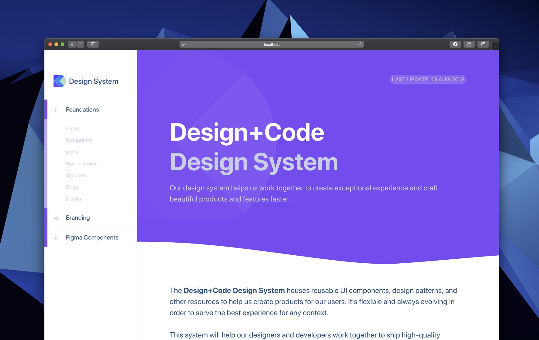
Design System in Figma
Complete guide to designing a site using a collaborative and powerful design system
Only a few years ago, Figma came out as the first design tool that utilized the power and accessibility of the Web while promising the same powerful features you’d expect from a native app. They surprised everyone with their real-time collaboration. Designers were ecstatic to finally be able to share their designs to their coworkers and clients with zero friction, and see multiple mouse pointers drawing shapes simultaneously. It was like magic.
We’ve come a long way since. Today, this instant collaboration approach has proven to be instrumental for creating a cohesive and reliable Design System. Everything exists on the Web, and Figma makes full use of it by bringing everything together for designers and developers.
What is a Design System?
 A design system is a living style guide that’s collaborative and code-connected. It’s not just a style guide where designers are the only contributors. It’s shared across the whole team, including designers, developers, product managers, etc. As a result, the design system should be cohesive, dynamic, reusable and maintainable both in design and code.
It starts with the styles and components in Figma, then move its way into the team library to finally become code components that exist in a place that’s easy to reference, contribute and version controlled, like a git repository.
This Course
 In this course, we’ll learn how to create this design system from scratch, using reusable styles, texts, colors, icons and components that can be shared across your team. We’ll start with the basics of design and work our way through advanced workflows and techniques to achieve powerful lasting results. We’ll design icons using the Vector Network, apply constraints for maximum adaptiveness and prototype quickly using the built-in tools. We’ll learn how to communicate our designs to developers so that everyone is in sync.
Anatomy of a Design System
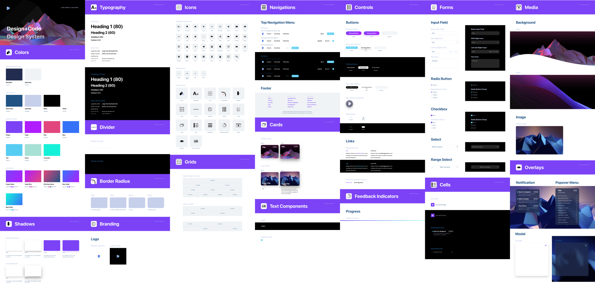 A design system is composed of all the elements in your final app. These elements should be cleanly organized into styles and components that are referenced in a single source of truth inside a separate document. This document should be easy to maintain by anyone in your team.
If your developers are involved in Figma, you can share your Design System file as a Web URL. If you build a site as well, you can use Live Embeds to reflect all the changes perfectly to your site.
As a final step, as you empower your designers to contribute code, it’s best to recreate all the components in code and show the code samples. A good example is the Zendesk Garden design system.
FOUNDATION
The foundation of your design system set the tone of your design language. It’s important to formulate the context for the branding, clearly indicating how your logo should be used appropriately. Also, you should set the main colors, typography and grids. 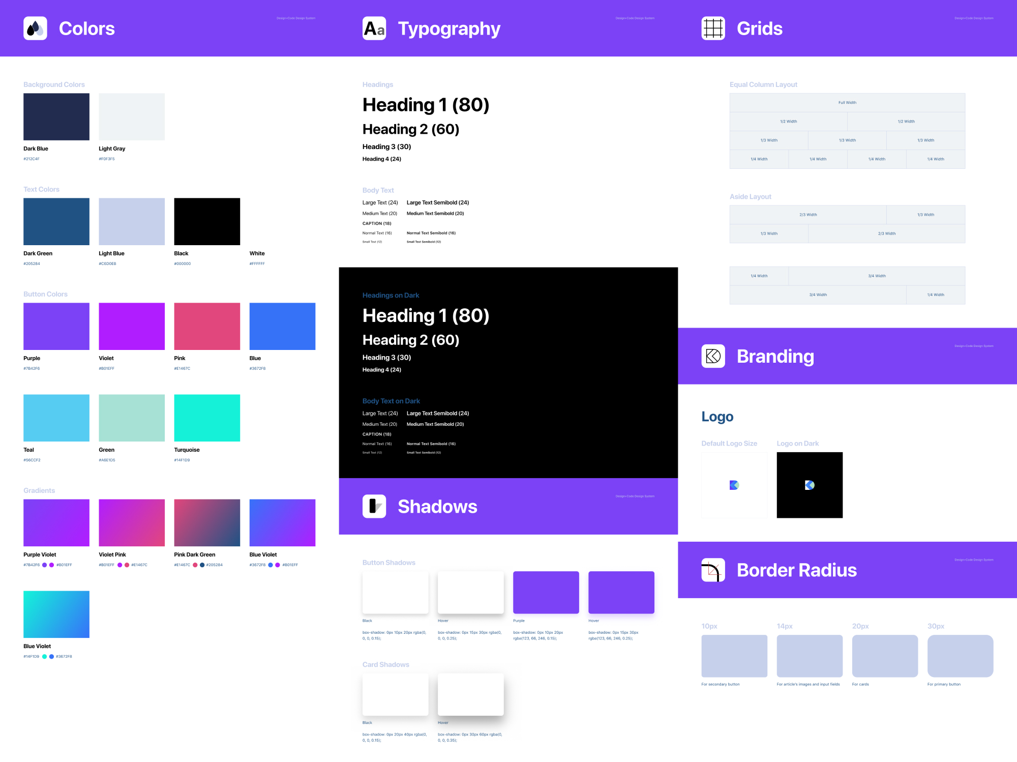
FIGMA STYLES
In Figma, most of the foundation element are set in the Styles, which contains Colors (including gradients and images), Text and even Effects. You can make them readily available as a Library. As you design, you can set these styles in your Inspector, for things like Text, Fill, Stroke and Effects. 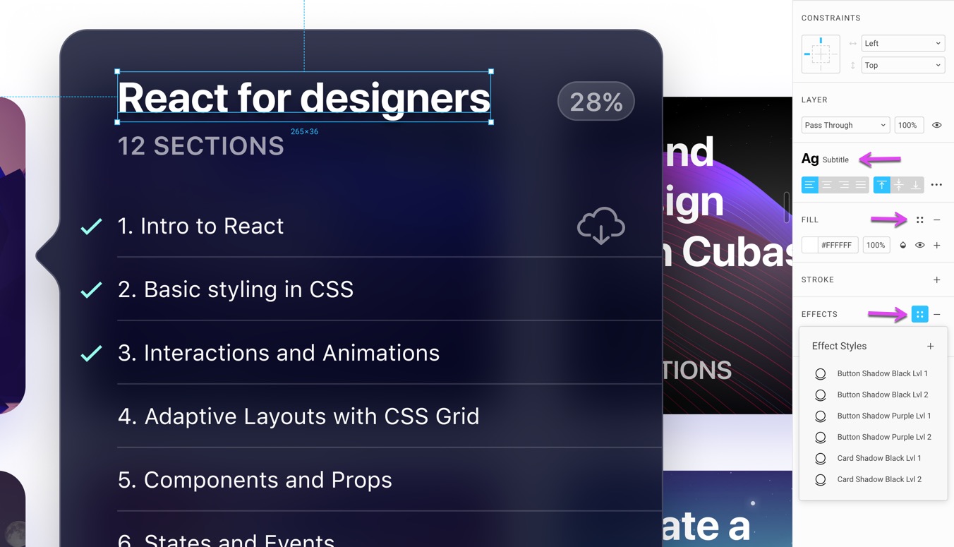
RULES
Another important piece of the foundation is setting the rules for negative spacing, page division and elements placement using grids. You can demonstrate how to harmonize elements using different sets of elements together, or use the drop shadows in order to be consistent with your design language.
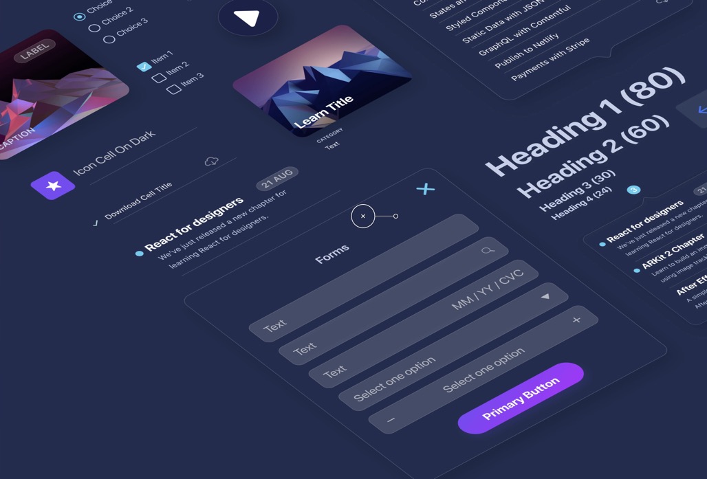
COMPONENTS
Components are building blocks for your design system. They’re generally collections of elements put together in a reusable way, such as for buttons, forms, navigations, cards, cells and overlays. Component elements like text content, colors and images can be customized in the Inspector. A button component can be duplicated many times, with different content and styles.
Additionally, you can have Components within Components, allowing you to customize even the most complex groups of elements, like icons, states and complex themes.
For example, a Table Cell can be a Component containing a toggle, which itself is another Component. That toggle can be switched between ON and OFF. 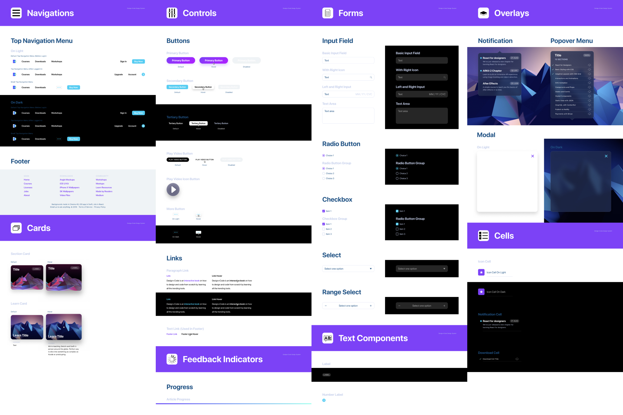
ASSETS
Assets can be icons, backgrounds, avatars and other images used to fill the content of your app. In general, you can use Unsplash, UINames, UIFaces and even our own 3D backgrounds (requires Pro account) to gather some presets for your user interface. Since these images can be set as Styles, it’s quick to create a list and use them in your design system. 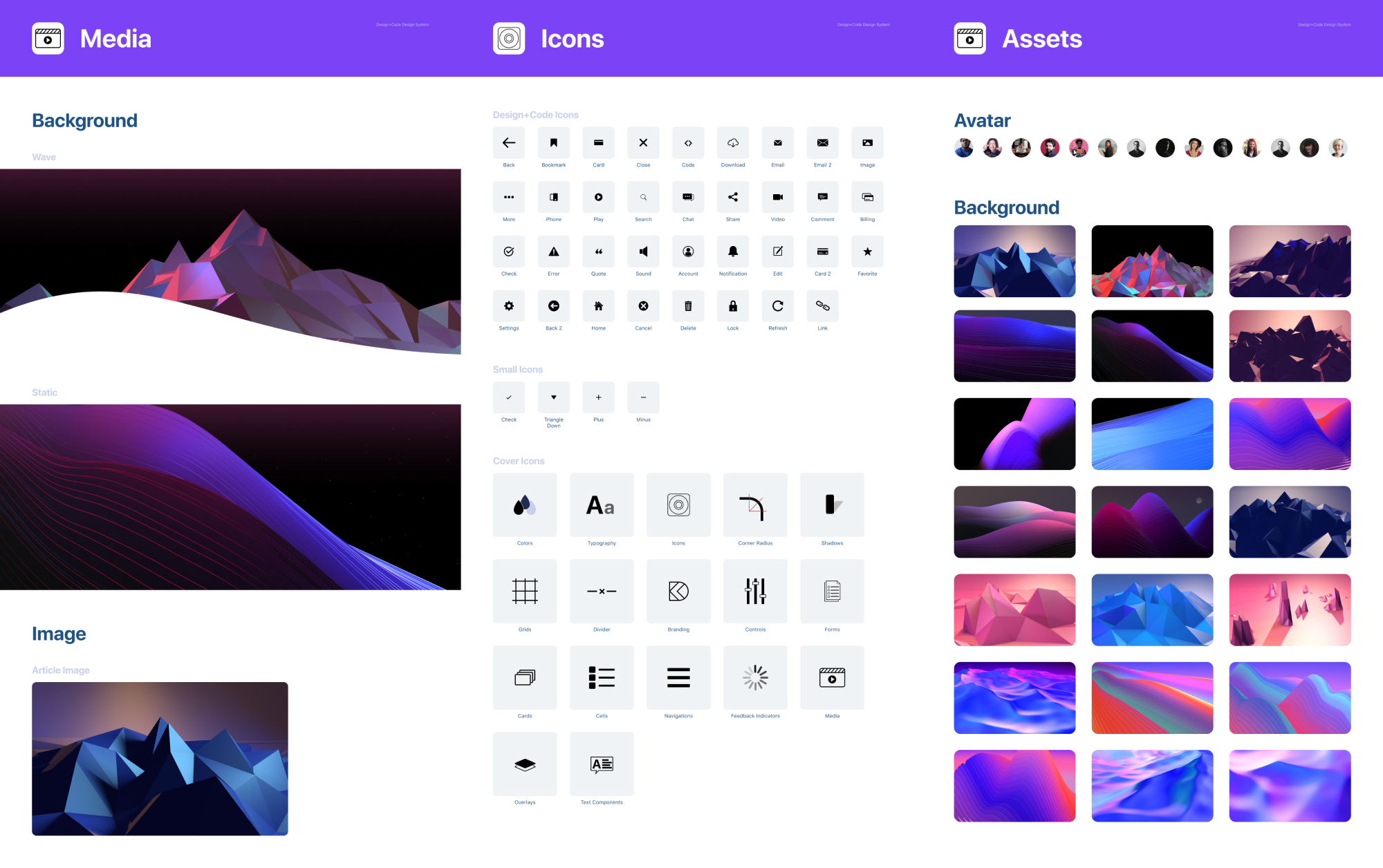
Figma VS Sketch
Let’s start from the beginning and highlight what makes Figma special. Nowadays, design tools are not vastly different from each other. The layout is similar and you’ll find the same essential features such as components, libraries and developer handoff.
While Sketch is rich in plugins like Craft, Abstract and Zeplin, Figma has all those tools embedded into it at the start. On top of that, Figma has real-time collaboration, has all its content exist on the Web and works on Windows.
Import from Sketch
Figma treats your Sketch files as first-class citizens. It is so good at importing that even an intricate and massive Library file like Angle can be imported to 95% accuracy. All the layers and symbols are kept intact.
Mac and Windows
What sets Figma apart is its collaborative and always accessible nature. Barriers such as requiring a Mac or downloading a large app is a thing of the past. Thanks to this, anyone can design and anyone can view your design, while you design. As someone who has used this daily, I cannot overstate how game-changer this is. No longer is your team over-relying on a third party tool, or an increasingly complex and fragmented set of plugins, Figma simply has everything from the start. Because a lot of developers work on Windows machines, this is truly essential to keeping your team in sync. Any developer can receive a link from you, inspect the design and get the colors, fonts and even CSS, Swift and SVG Code.
Real-Time Collaboration
Figma truly is the Google docs of design tools. Once you start collaborating with fellow designers, developers and clients in real-time on a design project, you’ll never want to go back. You can share your design with anyone and they can watch your progress, comment and even participate as you bring your pixels to life.
Version Control
In Figma, everything you do is automatically saved in the history for free. You can also manually commit (Command + Option + S) a version to keep things in a neat timeline. You don’t have to think about branches because the real-time collaboration allows you to ensure that nobody is stepping on each other’s toes. It’s actually a relief to not compare this too much to Git because a lot of designers struggle with the more advanced concepts of Git.
Vector Network
Figma introduced a powerful new way to design vectors. Instead of connecting paths one to one, you can create web-like connections, making the whole process of creating icons more flexible.
Performance
While most tools today focus on the hype train of new features, Figma simply focuses on a solid workflow with a performance that is unmatched by its peers. This is one of the main reasons why I switched from Photoshop in the first place. And for me, Figma is as fast you can get in a design tool.
When you work 8 hours a day on a tool, every second you save counts.
Every drag of a button and every text edit feels buttery smooth at 60 frames per second. Zooming in and out is without lag.
Team Library
Imagine Abstract, Google Docs and Sketch in a single tool. Imagine a more cohesive and smoother experience. That’s Figma. Team Libraries allow you to share your components, styles and assets across your whole team. You can enable and disable these in the Team Library icon at the top right. This is absolutely essential for your design system. 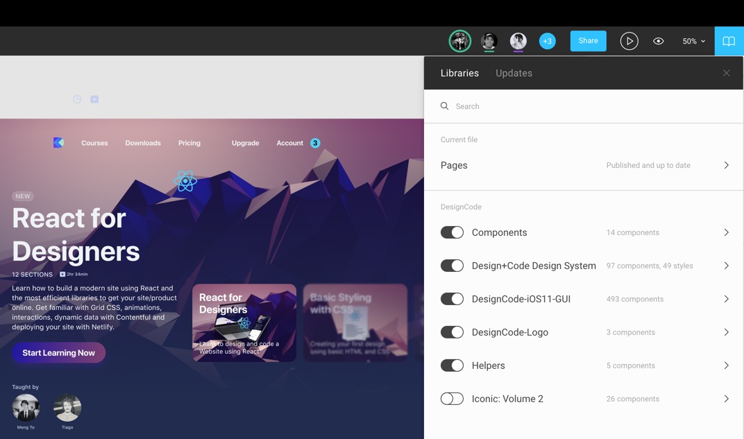
Live Embeds
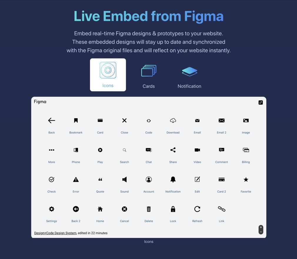 You can embed your Figma Frames in your Website by getting the iFrames HTML code. This allows you to get live access to your designs.
Text and Color Styles
In Figma, you set styles differently. They not only work for texts but also for colors and gradients and even effects like blur and drop shadows.
Components
Components are effortless in Figma. Unlike Sketch Symbols, you don’t need to go to another Page to edit the master components. Overrides can be edited directly in their respective layers inside the component.
Keyboard Shortcuts
The shortcuts in Figma are very similar to Sketch. Some key differences that are quite important to know:
- Command + Option + G creates a Frame for selected elements. A Frame is like an Artboard.
- Control + G to enable / disable Grid.
- K for Scale, which allows you to scale elements on the fly.
- C for Commenting. Comments are embedded in Figma directly instead of having to go through a different space.
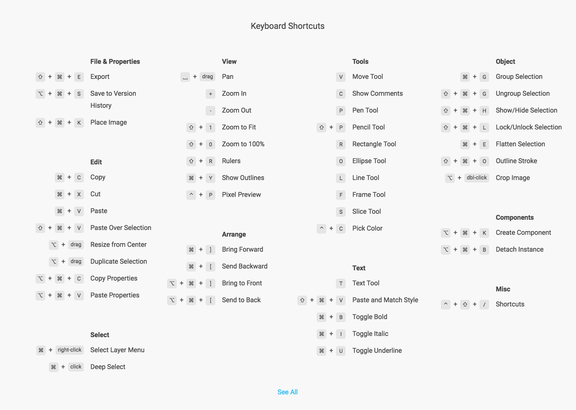
You can find more Keyboard shortcuts organized in a friendly format at shortcuts.design.
Constraints
Constraints in Figma are the same as Sketch. They allow you to set distances from the parent container, scale or align.
Prototyping
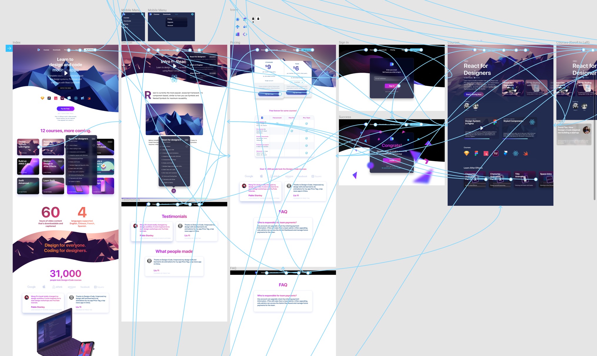 Figma makes it super simple to create prototypes using transitions without downloading a single third-party app. The prototype tool is in its own Tab in the Inspector. You set a Home screen, then connect to new screens using a string. Transition animations can be set between Instant, Dissolve, Move, Slide and Push.
Inspect
Any document in Figma can be shared with anyone. Most importantly, developers can come in and inspect design elements to get the color properties, sizes and distances. They can select any asset and decide to export to PNG, SVG or in code using Swift, Java or CSS.
More generally, invited people can be given the permission to view or to edit. This means that you can include virtually anyone in your team, including product managers, clients and any person via a link.
Commenting
The feedback loop in a team environment is extremely important. You can press C to add a targeted comment. A bubble will appear and you can @mention anyone in your team to send them notifications. Comments can be marked as resolved, just like in issue trackers. 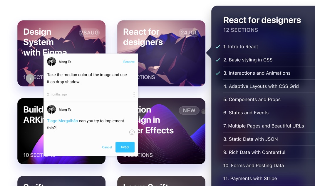
Download Figma
To get a superior Figma experience, you can download the desktop for Mac or PC. This will allow you to get access to local fonts and have a dedicated app for designing, without the large browser bars. The navigation is slightly improved where you have an additional Projects button and no more back / forward mechanisms, which can be slightly annoying if you have enabled gestures on the Mac.
Installing Local Fonts
In order to access fonts from your local computer, you’ll need to install a helper in your Account settings (if designing in the browser), or simply get the Figma desktop app.
Create Team
Either you’re alone or with dozens of people in your team, you should create a Starter Team, which is free until you have more than 3 projects and 2 editors. For most designers, this is plenty to get to 100% of the work that they need to do.
Figma Files and Projects
When you create a new Figma file, it will land in the Recent/Drafts. If you have a team set up, you can put your files inside a project. A project can be shared across your team. A file contains Frames (like Artboards) and Pages.
Pages
Typically, you use Pages to separate iOS from Android or Web. But since Files are so easy to access in projects, you can decide not use Pages. However, Pages can be powerful for sharing an entire project without having to select multiple files.
Starting Templates
You can visit Figma Resources to get some starting templates like Material and iOS UI Kits in addition to the default ones can are provided on your first Figma experience. That can be insanely useful for using elements like the status bar, tab bar, buttons without having to create them from scratch.
Additionally, you’ll find free icon sets like Iconic: Volume 1 and 2. As you click on these resources, they’ll simply be copied to your Drafts until you put them in a project. 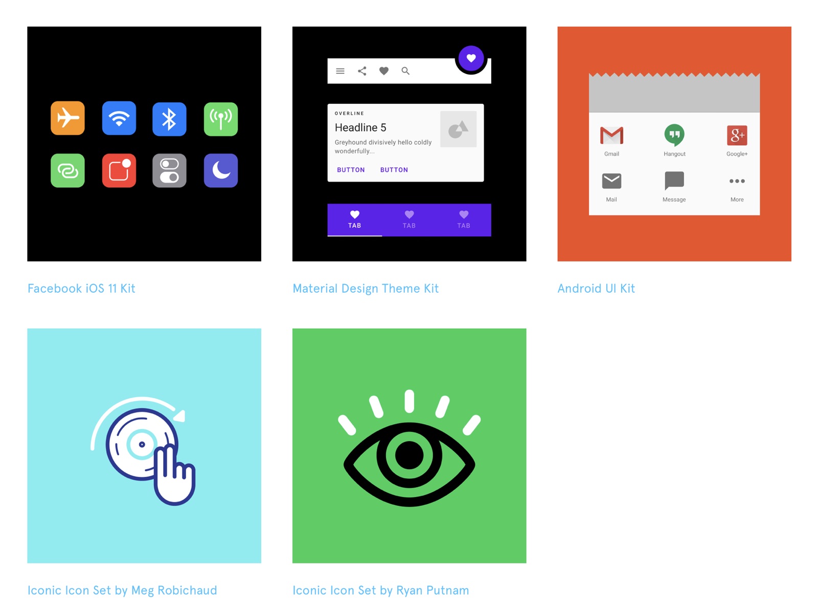
iOS 11 UI Kit by Design+Code
At Design+Code, we’ve been creating free iOS UI Kits for the past 3 years. We love giving back to the community. We’ve adapted this one to work with Figma components. It’s made to work with Team Library so that you can just drop the elements you need and they’re fully adaptive!